

A Raccoon, a Round Camera, and the Case Against Optimizing Everything


In this article:
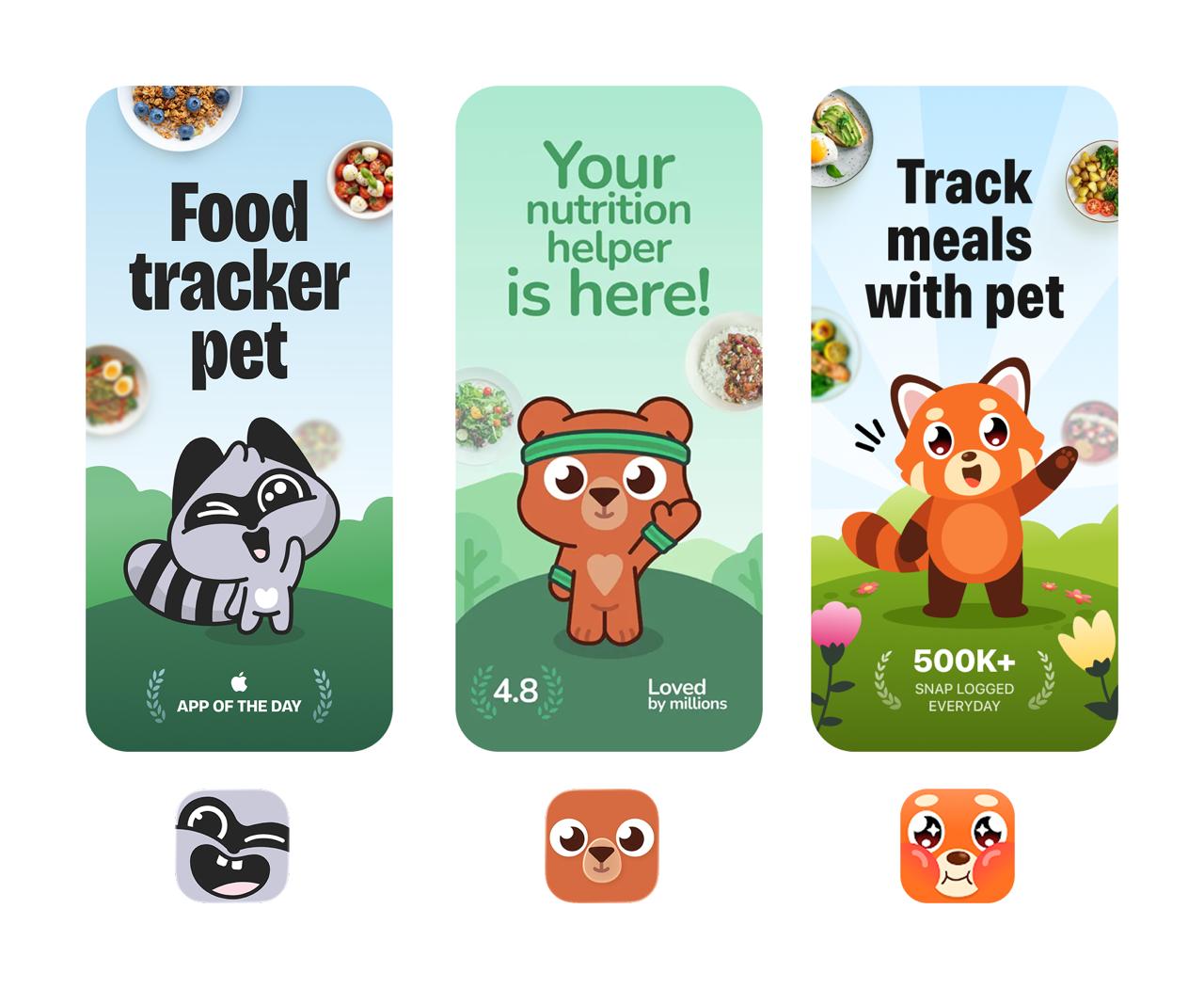
As BitePal took off, the copies started. Not just individual features, like the letter the raccoon sends when you haven't fed him in a while. Whole apps showed up that clone the product almost one for one. Only instead of a raccoon, they have a squirrel.
And you can really feel that their authors' main goal was to copy our product as fast as possible. AI made building an MVP fast and cheap: today almost anyone can assemble an app, test an idea, and ship a decent design. But if everyone can build an equally good MVP, the question becomes: why would anyone choose my product?
My answer grew out of two products: Reface and BitePal.
A product that didn't start with a problem
At Petcube, where I worked before, everything was clear. You worry about your dog when it's home alone, and the product solves that problem. It was at Reface that I first understood a strange thing: not every product starts with a user's problem. Reface had no problem to solve. It had face-swapping technology.
The tech could swap a face fairly quickly without training a separate model for each person. At the time, no one else could do that. At some point we figured it was worth putting this technology into people's hands as an entertainment app.
At first it worked only on static images, and the result was far from perfect. So the early versions of the app made GIFs; video came later. Processing a single clip cost so much in compute that we physically couldn't afford an app with hundreds of videos. We had literally one new short video a day.
These short videos were the ones celebrities started refacing and posting to their social media, and the app crashed almost daily under the flood of organic traffic. And probably one of the best product decisions of that period was a simple reface watermark on every video, which you could remove only with a subscription.
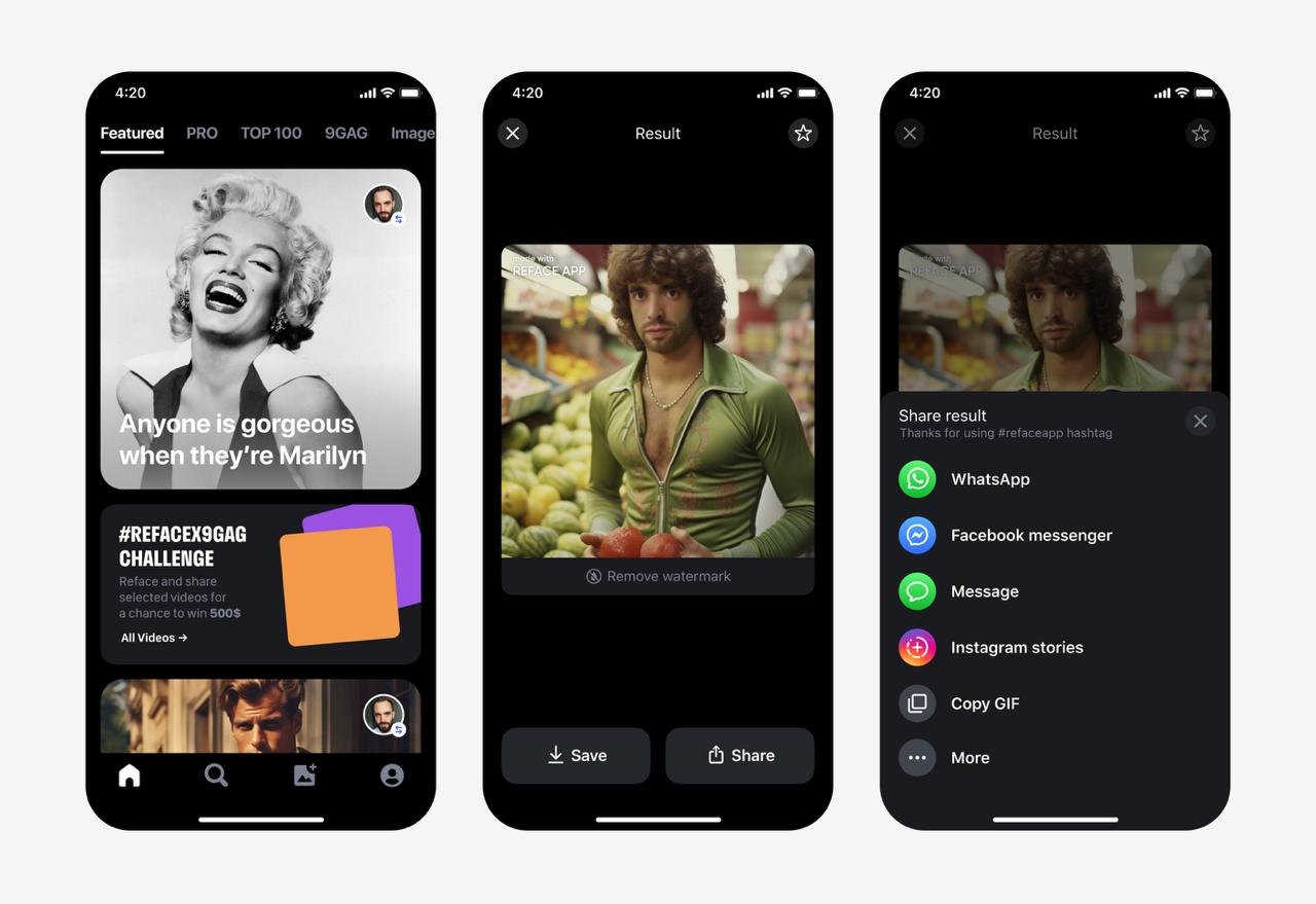
We did, of course, try to find the "right" use case. You know, make GIFs, entertain your friends. But it was immediately clear the technology could be used for more than fun. So at first we didn't even want to let users upload their own videos, and later we built a separate AI model that detected whether a video had been refaced. We had to invent the product and the rules for using it at the same time.
Let me confess what may be the biggest UX lie of my life. Remember the progress indicator in Reface while your result was generating? It meant almost nothing. In the first versions everything ran on good faith: the user had no idea when the server would return a result. Sometimes it was 8 seconds, sometimes 30. We didn't want to show just a spinner, because after 10 seconds the user might decide the app had frozen. But showing real linear progress was impossible.
So we built a progress bar that decelerated in a mathematically elegant way toward the end and never reached 100% until the server returned the result. And to keep the user from losing all hope, the captions above the bar kept changing too. The company still has an internal meme: "taking longer then usual..."

"The progress bar didn't show progress. It showed hope."
Good UX or manipulation? Still an open question.
Ads for apps that didn't exist
Around the time Reface appeared, a whole AI boom kicked off. New papers came out, open models showed up, and every week someone in the office would go, "look what AI can do now." And we were constantly thinking about what new product we could build.
I still have a separate Figma file with those experiments. A meme-caption generator for photos. A model that rates your look. A camera that explains paintings. A Tamagotchi you can talk to. And a lot more.
But instead of programming it right away, we first tested on ads whether anyone was even interested in the idea. I'd draw an ad that led to a fake App Store page. Everything there looked real: icon, screenshots, description, reviews, and a download button. If people wanted to download the app, we knew the idea had a shot.
We were basically selling a product that didn't exist yet.

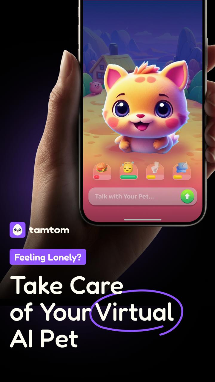
Most of these ads never turned into apps. But two ideas from that file eventually crossed into a single product: an AI that analyzes photos of food, and a Tamagotchi. That's how BitePal was born.
Calories won — and broke the product
We wanted to build an app about eating, but the main idea wasn't counting calories. We wanted people to simply want to eat better.
The user photographed their food. The raccoon "ate" it, commented on what he liked, gave it a score, and rewarded good eating habits: a balanced plate, enough protein, fiber, healthy fats. You didn't have to log everything you ate at all. Just the opposite: the interface nudged you to photograph the food the raccoon praised.
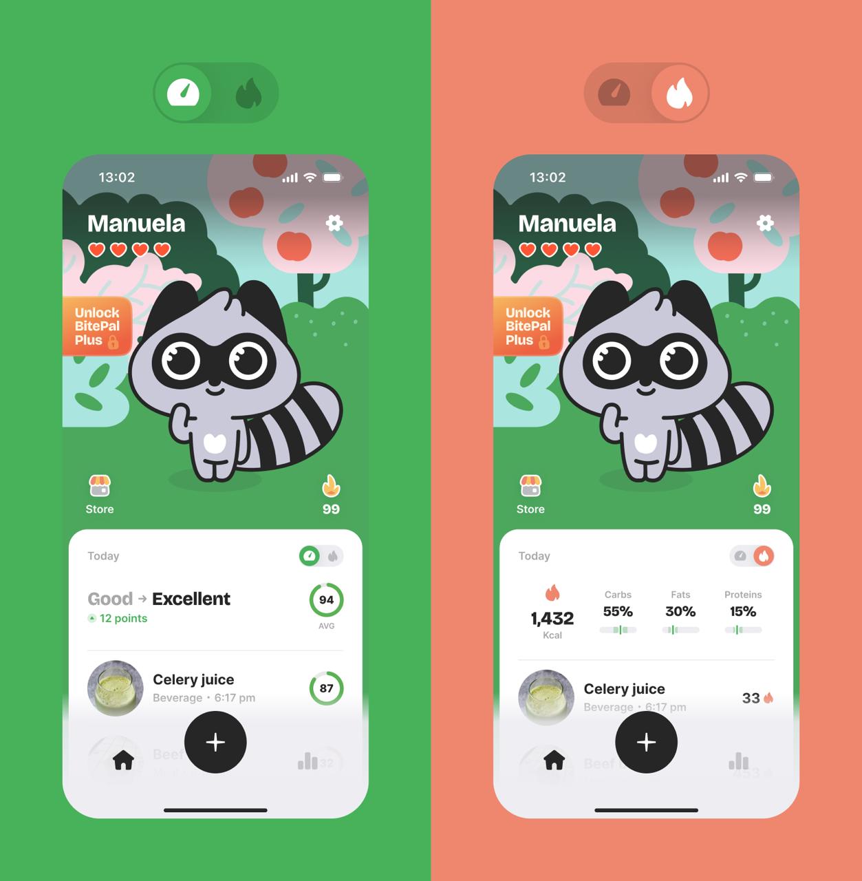
We deliberately didn't show calories. In the ads and on the screenshots we said outright that this was a food tracker without calories. How wrong we were.
People really did like BitePal 1.0. Users came back, fed the raccoon, wrote that he motivated them to eat more vegetables. There was just one small problem: almost no one wanted to pay for it.
"A product people love and a product they'll pay for aren't always the same thing."
Our onboarding sold the idea "you'll start eating better." Other trackers sold the promise "you'll lose weight." That promise was far stronger, and the calorie count was exactly what let them make it.
So we did what I really didn't want to do at first: we added calories. But we were afraid of breaking what people already loved us for, and for a while it was literally two products in one. The home screen got a toggle that switched modes: either calories, or our old food score. Scores stayed the default. It felt like an elegant compromise.
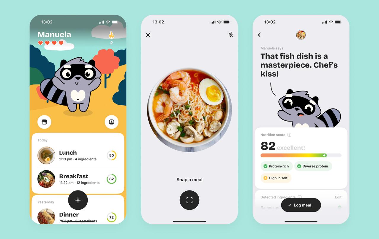
In the end, calories won. Not in the interface, but in the business. When we rewrote the onboarding from "start eating better" to "lose weight by summer," the results improved a lot. People understood the value right away and paid more willingly.
But calories completely broke the product. Before, the raccoon motivated you to photograph good food, and the user opened the app for praise. Now, to count a day's calories, you had to log everything: the salad, the croissant, the chocolate bar, the midnight raid on the fridge. The raccoon turned from a motivator into a moralizer. He punished the user for honestly logging everything they ate.
And here something interesting happened. It turned out there are people who don't want to weigh their food and look it up in a database just to find the calories. A roughly accurate calorie estimate from a photo suited them just fine. That's when we realized we were building not the most accurate tracker, but the most casual one. For people who hate classic calorie trackers. With a raccoon on top.
Decisions AI wouldn't have suggested
The first BitePal had a design idea I fought for tooth and nail. I badly wanted the camera mask for photographing food to be round.
It was less practical: a full-screen camera is obviously more convenient. But I wanted the interface to hint that the thing to photograph is the plate, and for that shape to then live on in other elements. And it did. Some decisions I designed right away, and some were born much later. In the weekly report, for example, all the logged dishes tumble down from the top. If the food photos had been ordinary rectangles, we'd never have come up with that animation.
If I'd asked AI to draw a camera screen for logging food, it would almost certainly have made it full-screen. And it would have been right. But then BitePal most likely wouldn't have gotten this small visual detail.
Similar story with editing the weight. People asked me why other calorie trackers hadn't come up with the same control. Because they were solving a different problem. In classic trackers you usually already know the weight of the food: you need to quickly enter 110 g, so the focus goes straight to the input field, and an open keyboard is completely logical there. In BitePal the main scenario was built around photographing from the very start. You most likely don't know the exact weight, but you might want to adjust what the AI estimated wrong. That's why we got a dial you can just spin left and right. If someone does need an exact 110 g, they can enter it by hand by tapping the number. It's just that this scenario is secondary for us, and less convenient in the interface.
Both the round camera and the dial are the consequence of one decision we made at the very beginning: photographing food instead of searching a database. The rest of the interface decisions simply followed from it.
If I ask Claude to evaluate BitePal's home screen, I'm almost sure it'll tear it apart. Top priority goes to a decorative element. To see your logged food, you have to scroll. Information density is low, and overall it's a strange design for a calorie tracker.
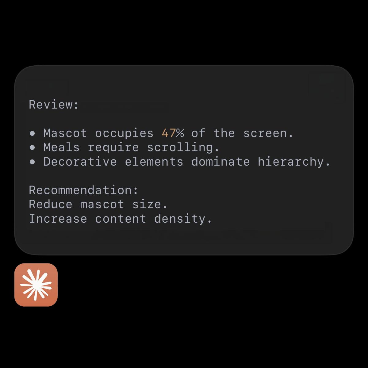
The thing is, people open BitePal not just for the macro numbers and the calories in avocado toast. They need the raccoon. What looks like a badly designed interface is actually part of the reason people love the product.
AI optimizes very well. It follows every heuristic, every UX principle, and common sense. But optimize BitePal all the way and you can end up with a very correct calorie tracker. Just without the raccoon and the round camera.
It seems the interface designer's role is gradually changing. Knowing every best practice is no longer the main value, because AI already knows them better than you do. The value is now somewhere else: understanding when one of those rules is worth breaking on purpose.
Hence a provocative claim: right now the best candidate for a junior UI/UX position is a graphic designer. When I started out as a graphic designer, the first thing I did after drawing a logo was open image search and check whether something similar already existed somewhere. Later, once I became an interface designer, the first thing I'd ask myself was: "is this a best practice?" And only then did I ask how beautiful or unique it was. While the interface designer learned the rules, the graphic designer trained a different muscle: how to find a solution that's aesthetic, has its own character, and feels alive. They spent their whole lives training to look not for the correct solution, but for the interesting one.
Copying a product isn't all that hard. It's much harder to reproduce the small details it's made of: the crafted icons, the tone of the text, why it's a raccoon specifically, why you feed him photos of food, and why during a fast you can put him to sleep. On their own, these are little things. Together they're the character that answers the question "why would anyone choose my product."
I think that with AI here, we'll compete less on the speed of building an MVP and more on products people will actually want to download.
grow your careerwith real-world knowledge
products with "bite"frequently asked questions
- What is a real product market fit example?
- How do you find product market fit?
- Does users loving a product mean it has product market fit?
- Will AI replace product designers?
more interesting articlesfor you

